
INTRODUCTION TO FREQUENCY DISTRIBUTIONS
A frequency distribution is a tabulation which shows the number of times (i.e. the frequency) each different value occurs. Refer back to Study Unit 2 and make sure you understand the difference between “attributes” (or qualitative variables) and “variables” (or quantitative variables); the term “frequency distribution” is usually confined to the case of variables.
PREPARATION OF FREQUENCY
DISTRIBUTIONS
Simple Frequency Distribution
A useful way of preparing a frequency distribution from raw data is to go through the records as they stand and mark off the items by the “tally mark” or “five-bar gate” method. First look at the figures to see the highest and lowest values so as to decide the range to be covered and then prepare a blank table.
Grouped Frequency Distribution
Sometimes the data is so extensive that a simple frequency distribution is too cumbersome and, perhaps, uninformative. Then we make use of a “grouped frequency distribution”.
Choice of Class Interval
When compiling a frequency distribution you should, if possible, make the length of the class interval equal for all classes so that fair comparison can be made between one class and another. Sometimes, however, this rule has to be broken (official publications often lump together the last few classes into one so as to save paper and printing costs) and then, before we use the information, it is as well to make the classes comparable by calculating a column showing “frequency per interval of so much”, as in this example for some wage statistics:
RELATIVE FREQUENCY DISTRIBUTIONS
All the frequency distributions which we have looked at so far in this study unit have had their class frequencies expressed simply as numbers of items. However, remember that proportions or percentages are useful secondary statistics. When the frequency in each class of a frequency distribution is given as a proportion or percentage of the total frequency, the result is known as a “relative frequency distribution” and the separate proportions or percentages are the “relative frequencies”. The total relative frequency is, of course, always 1.0 (or 100%). Cumulative relative frequency distributions may be compiled in the same way as ordinary cumulative frequency distributions
GRAPHICAL REPRESENTATION OF FREQUENCY DISTRIBUTIONS
Tabulated frequency distributions are sometimes more readily understood if represented by a diagram. Graphs and charts are normally much superior to tables (especially lengthy complex tables) for showing general states and trends, but they cannot usually be used for accurate analysis of data. The methods of presenting frequency distributions graphically are as follows:
- Frequency dot diagram
- Frequency bar chart
- Frequency polygon – Histogram –
We will now examine each of these in turn.
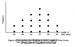
Frequency Dot Diagram
This is a simple form of graphical representation for the frequency distribution of a discrete variate. A horizontal scale is used for the variate and a vertical scale for the frequency. Above each value on the variate scale we mark a dot for each occasion on which that value occurs. Thus, a frequency dot diagram of the distribution of times taken to complete a given task, which we have used in this study unit, would look like Figure 4.1.
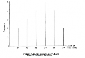
Frequency Bar Chart
We can avoid the business of marking every dot in such a diagram by drawing instead a vertical line the length of which represents the number of dots which should be there. The frequency dot diagram in Figure 4.1 now becomes a frequency bar chart, as in Figure 4.2.
Frequency Polygon
Instead of drawing vertical bars as we do for a frequency bar chart, we could merely mark the position of the top end of each bar and then join up these points with straight lines. When we do this, the result is a frequency polygon, as in Figure 4.3.
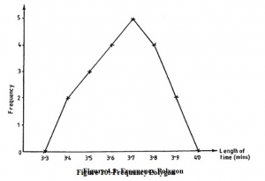
Note that we have added two fictitious classes at each end of the distribution, i.e. we have marked in groups with zero frequency at 3.3 and 4.0.
This is done to ensure that the area enclosed by the polygon and the horizontal axis is the same as the area under the corresponding histogram which we shall consider in the next section.
These three kinds of diagram are all commonly used as a means of making frequency distributions more readily comprehensible. They are mostly used in those cases where the variate is discrete and where the values are not grouped. Sometimes frequency bar charts and polygons are used with grouped data by drawing the vertical line (or marking its top end) at the centre point of the group.
Histogram
This is the best way of graphing a grouped frequency distribution. It is of great practical importance and is also a favourite topic among examiners. Refer back now to the grouped distribution given earlier in Table 4.4 (ages of office workers) and then study Figure 4.5.
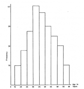
We call this kind of diagram a “histogram”. The frequency in each group is represented by a rectangle and – this is a very important point – it is the AREA of the rectangle, not its height, which represents the frequency.
When the lengths of the class intervals are all equal, then the heights of the rectangles represent the frequencies in the same way as do the areas (this is why the vertical scale has been marked in this diagram); if, however, the lengths of the class intervals are not all equal, you must remember that the heights of the rectangles have to be adjusted to give the correct areas. Do not stop at this point if you have not quite grasped the idea, because it will become clearer as you read on.
Look once again at the histogram of ages given in Figure 4.5 and note particularly how it illustrates the fact that the frequency falls off towards the higher age groups – any form of graph which did not reveal this fact would be misleading. Now let us imagine that the original table had NOT used equal class intervals but, for some reason or other, had given the last few groups as:
The last two groups have been lumped together as one. A WRONG form of histogram, using heights instead of areas, would look like Figure 4.6.
Now, this clearly gives an entirely wrong impression of the distribution with respect to the higher age groups. In the correct form of the histogram, the height of the last group (50-60) would be halved because the class interval is double all the other class intervals. The histogram in Figure 4.7 gives the right impression of the falling off of frequency in the higher age groups. I have labelled the vertical axis “Frequency density per 5-year interval” as five years is the “standard” interval on which we have based the heights of our rectangles.
Often it happens, in published statistics, that the last group in a frequency table is not completely specified. The last few groups may look as in Table 4.9:
How do we draw the last group on the histogram?
If the last group has a very small frequency compared with the total frequency (say, less than about 1% or 2%) then nothing much is lost by leaving it off the histogram altogether. If the last group has a larger frequency than about 1% or 2%, then you should try to judge from the general shape of the histogram how many class intervals to spread the last frequency over in order not to create a false impression of the extent of the distribution. In the example given, you would probably spread the last 30 people over two or three class intervals but it is often simpler to assume that an open-ended class has the same length as its neighbour. Whatever procedure you adopt, the important thing in an examination paper is to state clearly what you have done and why. A distribution of the kind we have just discussed is called an “openended” distribution.
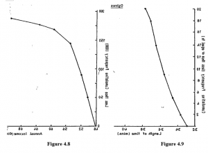
The Ogive
This is the name given to the graph of the cumulative frequency. It can be drawn in either the “less than” or the “or more” form, but the “less than” form is the usual one. Ogives for two of the distributions already considered in this study unit are now given as examples; Figure 4.8 is for ungrouped data and Figure 4.9 is for grouped data.
Study these two diagrams so that you are quite sure that you know how to draw them. There is only one point which you might be tempted to overlook in the case of the grouped distribution – the points are plotted at the ends of the class intervals and NOT at the centre point. Look at the example and see how the 168,000 is plotted against the upper end of the 56-60 group and not against the mid-point, 58. If we had been plotting an “or more” ogive, the plotting would have to have been against the lower end of the group.
PICTOGRAMS
Introduction
This is the simplest method of presenting information visually. These diagrams are variously called “pictograms”, “ideograms”, “picturegrams” or “isotypes” – the words all refer to the same thing. Their use is confined to the simplified presentation of statistical data for the general public. Pictograms consist of simple pictures which represent quantities
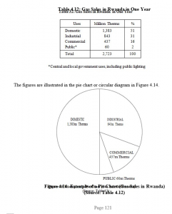
PIE CHARTS
These diagrams, known also as circular diagrams, are used to show the manner in which various components add up to a total. Like pictograms, they are only used to display very simple information to non-expert readers. They are popular in computer graphics.
BAR CHARTS
We have already met one kind of bar chart in the course of our studies of frequency distributions, namely the frequency bar chart. A “bar” is simply another name for a thick line. In a frequency bar chart the bars represent, by their length, the frequencies of different values of the variate. The idea of a bar chart can, however, be extended beyond the field of frequency distributions, and we will now illustrate a number of the types of bar chart in common use. I say “illustrate” because there are no rigid and fixed types, but only general ideas which are best studied by means of examples. You can supplement the examples in this study unit by looking at the commercial pages of newspapers and magazines.
Note that the lengths of the components represent the amounts, and that the components are drawn in the same order so as to facilitate comparison. These bar charts are preferable to circular diagrams because:
- They are easily read, even when there are many components.
- They are more easily drawn.
- It is easier to compare several bars side by side than several circles.
Horizontal Bar Chart
A typical case of presentation by a horizontal bar chart is shown in Figure 4.17. Note how a loss is shown by drawing the bar on the other side of the zero line.
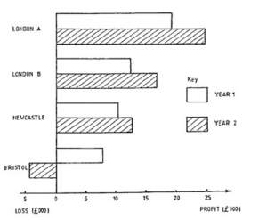
Pie charts and bar charts are especially useful for “categorical” variables as well as for numerical variables. The example in Figure 4.17 shows a categorical variable, i.e. the different branches form the different categories, whereas in Figure 4.15 we have a numerical variable, namely, time. Figure 4.17 is also an example of a multiple or compound bar chart as there is more than one bar for each category.
GENERAL RULES FOR GRAPHICAL PRESENTATION
There are a number of general rules which must be borne in mind when planning and using graphical methods:
- Graphs and charts must be given clear but brief titles.
- The axes of graphs must be clearly labelled, and the scales of values clearly marked.
- Diagrams should be accompanied by the original data, or at least by a reference to the source of the data.
- Avoid excessive detail, as this defeats the object of diagrams.
- Wherever necessary, guidelines should be inserted to facilitate reading.
- Try to include the origins of scales. Obeying this rule sometimes leads to rather a waste of paper space. In such a case the graph could be “broken” as shown in Figure 4.18, but take care not to distort the graph by over-emphasising small variations.
THE LORENZ CURVE
Purpose
One of the problems which frequently confronts the statistician working in economics or industry is that of CONCENTRATION
Other Uses
Although usually used to show the concentration of wealth (incomes, property ownership, etc.), Lorenz curves can also be employed to show concentration of any other feature. For example, the largest proportion of a country’s output of a particular commodity may be produced by only a small proportion of the total number of factories, and this fact can be illustrated by a Lorenz curve.
Concentration of wealth or productivity, etc. may become more or less as time goes on. A series of Lorenz curves on one graph will show up such a state of affairs. In some countries, in recent years, there has been a tendency for incomes to be more equally distributed. A Lorenz curve reveals this because the curves for successive years lie nearer to the straight diagonal.