
UTILITY
Meaning of Utility
Economists have always faced problems in explaining clearly why people are prepared to make sacrifices to obtain many of the goods and services which they evidently wish to have. In a market economy this difficulty can be stated as “Why do we buy the things we buy?” Often we do not “need” them in the strict sense that they are necessary to our survival. In fact our basic needs are really very small compared with many of the things on which we spend our money in advanced market economies. We can talk in terms of “wants” and recognise that there seems to be no limit to these wants. We also have to recognise that at any given time we are likely to want some things more than others.
What, then, is the quality that goods must possess that makes us want to acquire them? Clearly this will differ with different goods. Some may be pleasant to eat, some attractive to look at, some comfortable or fashionable to wear and so on. The one general term we can apply to all goods and services is that they provide us with utility. This does not necessarily mean that they are useful in the sense that they help us to do something we could not do before we had them but simply that we perceive in them some quality that makes us willing to make some degree of sacrifice (usually of money) in order to acquire them.
Most of us measure the strength of our desire to buy something in terms of the price we are prepared to pay for it. When, therefore, an estate agent asks a potential house buyer, “How much are you prepared to offer for this house?” the agent is, in effect, asking the buyer to indicate the value of the utility which the house has for him or her.
More often we find ourselves making comparisons of utility. This arises partly because of the basic economic problem of unlimited wants and scarce resources, so that ranking our wants so we can decide what we can afford to buy is for most people an almost daily occurrence; but it also arises because, in modern advanced economies there is likely to be a range of different goods to satisfy any particular want. If I want to travel by public transport from Kigali to Goma I could do so by motor coach or by air. My want is to get from Kigali to Goma, and two options offer the utility to satisfy this want. Each involves different sacrifices of money and time and offers different associated utilities of convenience and comfort. My choice will depend on the resources available to me (how much money I can afford to pay and how much time I have) and on my valuation of the utility afforded by each option. Notice, further, that this utility is not an absolute quality but depends on why I want to make the journey. If it is part of a holiday then I might prefer the coach, but if I am attending a business meeting from which I hope to achieve a financial benefit and need to be fresh and alert then the air option is likely to offer the greatest utility – greater, probably, than the price of the fare.
All this may seem very involved, but an appreciation of utility and how it can influence our actions can be a very great help in understanding the true nature of economic demand.
Total and Marginal Utility
Our valuation of the utility provided by any good depends on how strongly we want to acquire it. While there may be several elements involved in this, e.g. we find it attractive or useful, or think it will impress our friends or neighbours, one factor that is always relevant is the amount of that or a similar good we already possess. Suppose I have enough spare cash at the end of the week to buy either a pair of trousers or a pair of shoes but not both, though I would like both. If I already have an adequate supply of trousers for the next few months but do not have any spare shoes then, assuming that their prices are roughly similar, I am likely to buy the shoes. This does not mean that I always value shoes more highly than trousers but that, considering what I already have at the present time, I perceive greater utility in some additional shoes than in additional trousers.
By now, especially if you have remembered the explanation of marginal product in Study Unit 1, you will recognise that I have just given an example of marginal utility, i.e. the change in total utility for a good or group of goods when there is a change in the quantity of those goods already possessed.
Most of the important decisions relating to the demand for goods and services are influenced by valuations of marginal utility compared with the prices of these goods. The more pairs of trousers I possess the less value am I likely to place an obtaining more and the more likely am I to spend my available money on other things of comparable price whose marginal utilities are higher.
Willingness to buy thus depends on the comparison of marginal utility with price, so to some extent it is reasonable to value utility in terms of price. To return to the original house buyer example, if the buyer says to the agent, “My highest offer is RWF20,000,000”, then for this buyer the value of the marginal utility of the house is RWF20,000,000. If this is or will be the buyer’s only house then, of course, it is also the total utility.
We must also bear in mind that money itself has utility. If I am saving money for a major holiday or for an expensive durable (long lasting) good such as a house or furniture, then I may place a high value on money savings and be less inclined to buy trousers and shoes as long as I have enough of these for my immediate needs. If my income is secure and rising, my valuation of the marginal utility of money could be lower and I am more likely to spend it on goods. If, however, my job is not secure and redundancy or retirement is a serious possibility, my valuation of the marginal utility of money is likely to rise and I will spend less on goods and services. You can easily see the implications of this for the general demand for consumer goods during periods of economic uncertainty when people think they are likely to have less money in the future. Just as the marginal utility of a good diminishes as the quantity already possessed rises, so marginal utility rises as the quantity of a good already possessed falls – or is expected to fall in the near future.
Maximising Utility from Available Resources
This relationship between total and marginal utility can be illustrated in a simple graph as in Figure 2.1.
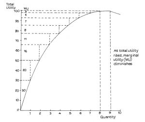
Suppose I have no use for more than 8 pairs of trousers. This number would provide maximum utility to which we can give a hypothetical numerical value of, say, 100 (representing 100% of the total) but clearly the largest marginal utility would be provided by the first pair. After this purchase the marginal utility of each additional pair diminishes, as indicated by the figures under MU to the right of the vertical axis. The total of 100 is reached with the eighth pair. If I have a ninth, no further utility is added – the total remains at 100. Should I receive a tenth pair my total utility actually falls: perhaps they take up space in my wardrobe I would rather have for something else.
Does this, then, mean that I should aim at keeping eight pairs of trousers all the time? Not necessarily, since Figure 2.1 takes no account of other important considerations, which include:
− the price of trousers, i.e. the sacrifice I must make to buy them
− my desire for other goods and services, i.e. other marginal utilities ( I would not, for example, be too pleased to have eight pairs of trousers if I possessed only one shirt, nor would trousers satisfy my hunger if I did not have enough food to eat)
− how much money I have, i.e. my marginal utility for money
Only when all these are taken into account would it be possible to estimate how many pairs of trousers would represent, for me, the best total to try and achieve.
Assuming rationality, in the sense explained in Study Unit 1, the most satisfactory quantity of trousers for me would be where my marginal utility gained from the last RWF1 spent on trousers just equalled the marginal utility per RWF1 spent on all other available goods and services, and where this also equalled the marginal utility of money. On the assumption that we are valuing utility in monetary terms the marginal utility of the last RWF1 of money = 1.
Putting this statement a little more formally as an equation and using the symbols, MUA to denote the marginal utility for the good A, MUB for the marginal utility for the good B, PA for the price of A, PB for the price of B and so on, we can say that consumers achieve a position of equilibrium in their expenditure when for them:
MUA = MUB = KK MUN =1 (which = the marginal utility of money)
PA PB PN
In this state of equilibrium consumers cannot increase their total utility from all goods and services by any kind of redistribution of spending. Spending more on A and less on B, for example, would mean that the marginal utility of A would fall and so be less than that of the marginal utility of B, which would rise and be less than the marginal utility of other goods, including money. Also the utility gain from A would be less than the utility lost from B so total utility would have fallen. No one rationally spends RWF1 to receive less than RWF1’s worth of utility.
INDIFFERENCE CURVES
What is an Indifference Curve?
An indifference curve is a graph linking all the combinations of two goods or two groups of goods which provide the same level of total utility for an individual, group of people or community. It is called an indifference curve because there is no preference for one combination over any of the others. All offer the same amount of utility or satisfaction, so that people are indifferent as to which combination they have.
One curve can, of course, indicate only one level of utility. If the resources available to acquire the goods were increased people could move to a higher level, and if resources fell they would have to be satisfied with
a lower level. We can, therefore, imagine that any one curve is really part of a map of very many curves all representing different levels of total utility.
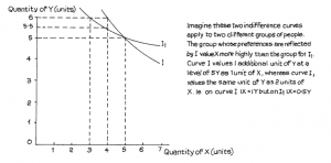
A simple example of an indifference curve is shown in Figure 2.2.
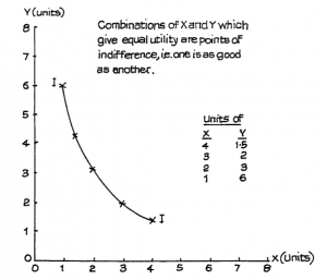
From the table and the curve we see that the person whose curve this is would have the same utility from 4 units of X and 1.5 of Y as from 3 units of X and 2 of Y or from 2 units of X and 3 of Y. The curve is convex to the origin of the graph since it is based on the principle already explained, of diminishing marginal utility.
According to this curve, when the person has just 1 unit of X but 6 of Y, he or she is prepared to give up 3 units of Y to gain 1 more unit of X, i.e. 1X has the same value as 6Y. However, when that person has 3 units of X, he or she will only be prepared to give up 0.5Y in return for one more X, i.e. with 3 units of X possessed, a further unit of X is valued at only 0.5Y. Thus the marginal utility of X has diminished from 3Y to 0.5Y as more X is accumulated.
You may think this is a rather involved way to illustrate the fairly common-sense principle that most people readily accept – that the more we have of something the less value we put on gaining yet more of the same and the more we would prefer to have something else. This is all that we mean by diminishing marginal utility.
Indifference Curve Analysis and Income Changes
Remember that the indifference curve is not a demand curve. By itself it tells us nothing about how much of a good we are likely to buy; it only indicates relative preferences between different goods or groups of goods. As we noted earlier in this study unit, to be able to estimate how much of a good people may be prepared to buy, in a market economy, we also need to know:
− the price of the good
− the amount of money they have available.
To carry out any kind of indifference curve analysis, therefore, we must take these two factors into consideration.
Suppose that the price of X is RWF3 per unit while that of Y is RWF2 per unit. Suppose also that the amount of money available for spending on X and Y is limited to RWF12.
Assuming that the full RWF12 is spent there is a range of spending possibilities. These are:
- The whole RWF12 is used to buy X with nothing spent on Y. At a unit price of X of RWF3 this would buy 4 units of X.
- The whole RWF12 is used to buy Y with nothing spent on X. At a unit price of Y of RWF2 this would buy 6 units of Y.
- A combination of X and Y which involves a total price of RWF12, e.g. 2 units of X (2 × RWF3 = RWF6) and 3 units of Y (3 × RWF2 = RWF6).
These possibilities are illustrated in the linear (straight line) spending possibilities curve of Figure 2.3. The spending possibilities curve is sometimes called the spending possibilities line, to help to distinguish it from the indifference curve, and it is also sometimes called the budget line.
Figure 2.3
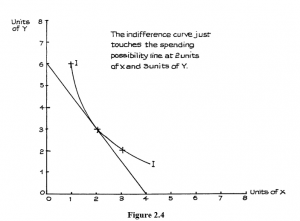
We now have two curves: one, the indifference curve, shows us combinations of X and Y that provide us with the same level of total utility or satisf
Figure 2.5 also shows how movement to a higher spending possibility line allows movement to a higher indifference curve, where there is a greater level of total utility or satisfaction. The point where the new curve just touches the higher spending possibility line is at a level where more of both X and Y is obtained.
This movement to a higher indifference curve results in more of both X and Y being bought. This is a reasonable expectation: if our income rises we can spend more on most goods. However, there may be some exceptions. As incomes rise, people’s pattern of spending may change; the extra income may permit people to switch spending from some goods to preferred substitutes. The diet of people on low incomes may include a substantial amount of cassava or potatoes, but as their incomes rise they may choose a more varied diet, spending less on cassava or potatoes. If this happens we can say that cassava and potatoes are perceived by such people as inferior goods; they may, perhaps, buy more fruit, biscuits and other foods.
When this happens there has been a change in the relative preferences between goods and this will be reflected in a change in the shape of a higher indifference curve, as illustrated in Figure 2.6. Here a rise in income allows the spending possibilities line to move outwards from AB to A1B1 and the higher spending permits movement to a preferred combination of goods on the higher indifference curve I1. This indifference curve is flatter than the lower curve I, which means that X is valued less highly compared with Y. The amount of X that has to be given up to gain a given amount of Y is less as you move along I1 than if you move along I. You can see this in Figure 2.7.
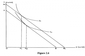
In curve I the group puts the same utility value on 5 units of X and 5 units of Y as it does on 4 units of X and 6 units of Y. Thus at this level on indifference curve I, 1 unit of X = 1 unit of Y.
In curve I1 the different group puts the same utility value on 5X and 5Y as it does on 3 units of X and 6 units of Y or 4 units of X and 5.5 units of Y. The flatter curve, therefore, values X at half as much Y as the steeper curve at the levels examined.
Notice that showing two curves intersecting in this way indicates that they must either reflect the preferences of different groups or the same group at different times. They cannot possibly relate to the same group at the same time, since 5X and 5Y cannot at the same time have the same utility as both 4X and 6Y and 3X and 6Y.
Remember the flatter the indifference curve the greater the preference for the good measured along the vertical or Y axis; the steeper the indifference curve the greater the preference for the good measured along the horizontal or X axis. Thus, if the indifference curves get flatter as income and total utility levels increase, this suggests that people are switching their spending preferences towards the good or goods measured along the Y axis. If they do this to the extent that the quantity purchased actually falls following an income rise then the goods on the horizontal axis can be described as “inferior” in economic terms.
Indifference Curve Analysis and Price Changes – Giffen Goods
The change illustrated in Figure 2.5 assumed that the prices of X and Y remained the same.
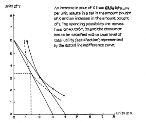
Suppose that, instead of a spending change, there was a price change. Let us say that the price of X is increased to RWF4 per unit but that of Y stays the same at RWF2. The two extreme possibilities for a total amount of spending of RWF12 are now 6 units of Y (no X) and 3 units of X (no Y). The line between these two points on the graph shows all possible combinations of X + Y that can be bought for the RWF12. This line no longer meets our original indifference curve. The old combinations of 2X + 3Y would now cost RWF14 – above the limit of RWF12. A new mixture of X and Y has to be obtained, and this we see in Figure 2.8.
The lower indifference curve (dotted in the graph) touches the spending line, to give a package of rather less X but a little more Y. When using indifference curves in this way remember, as mentioned earlier in this study unit, to imagine that there is an indifference “map” containing a mass of curves, each representing a particular level of total utility or satisfaction. The further away from the origin (where the axes of the graph meet) we move, the higher the level of utility represented by the curve because it represents more of both X and Y.
The changes shown in these illustrations all support the earlier statement that a rise in price of a commodity will lead to a fall in the quantity demanded of that commodity.
In Figure 2.8 a price rise for X resulted in less of X being purchased; this is what we would normally expect for most goods. However, some economists have argued that this may not always be the case. They point out that a price change will not only change people’s perception of other goods as substitutes but will also affect the income that is available for spending, particularly if the price in question relates to something which is bought regularly and so makes up a significant part of people’s incomes, especially if the incomes were low. If the price of this basic good rose so that people could no longer afford to buy preferred substitutes then it is, perhaps, conceivable that they would be forced to buy more rather than less of the good whose price has risen. In this very special (and extremely rare) case a price rise could be said to lead to increased purchases while a price fall, by releasing spendable income to buy preferred goods, could lead to less being bought.
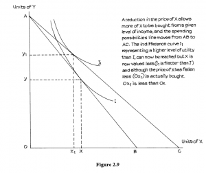
This possibility is illustrated in Figure 2.9, where a reduction in the price of X allows the spending possibility line AB to move to AC for the same level of income. This allows buyers to achieve the higher level of utility or satisfaction represented by the indifference curve I1 which is higher than the curve I – the highest attainable by spending possibility AB. The preferred combination of X and Y is now Ox1 and Oy1. This provides more satisfaction than the old combination of Ox and Oy but, as we see from the diagram, x1 represents a smaller quantity of X than x. Thus people have used the extra money made available by the price reduction of x to buy more of Y and less of X rather than more of both, which would have been the case if X had been a normal good.
The reason for this is clear from the diagram. The higher indifference curve I1 is flatter than the lower curve I. Thus X is perceived as being so inferior to Y that even the amount of spendable income change resulting from the price reduction is sufficient to allow people to switch their buying to Y from X. Such a good is known as a Giffen good, Giffen being the name of the person who first drew attention to the possibility.
As well as illustrating the so-called Giffen effect, this example also shows that when a good’s price changes there are two consequences, both of which are likely to affect people’s purchases.
- If a price of, say, X changes while the prices of other goods, say Y, Z and so on, stay the same there is a change in the pattern of relative prices. If good Y is seen as substitute for X, and if the price of X rises with the price of Y staying unchanged, then X has become dearer compared with Y and some people who previously bought X are likely to transfer to Y which is now relatively cheaper than before. For X and Y, think of, perhaps, potatoes and rice or tea and coffee. If the price of tea rises, people will not stop drinking tea but some will start to switch to coffee when previously they would have drunk tea. We can expect that there will be some switching of purchases to substitutes when one good becomes relatively more expensive than its rivals. This is called the substitution effect of the price change.
- As we have seen earlier, if the price of tea rises any given quantity of tea purchased requires more income than it did before the price rise. This will reduce the amount of income available for spending on other things, including possible extra purchases of tea. In the same way if, say, the price of coffee were to fall, this would increase the amount of income available for spending on other things – including extra coffee. This is called the income effect of the price change.
These two effects together make up the total shift in buying following a price rise or fall. They can be analysed with the help, once more, of indifference curves.
Look at Figure 2.10. This uses the symbols X and Y as before to show they can apply to any goods but you can think of X as coffee and Y as tea, if you wish.
Here we see the effect of a reduction in the price of X from RWF3 per unit to RWF2 per unit. Y stays at RWF3 per unit and disposable income stays at RWF48. The maximum possible purchases of X, assuming no purchases of Y, rises from 16 to 24 units.
Suppose the original combination of X and Y actually purchased, given the indifference curve I, was:
9Y(RWF27) + 7X(RWF21) = RWF48 at B, before the price change.
After the change in price, the new combination on the higher indifference curve I1 would be:
9 Y(RWF28) + 10X(RWF20) = RWF48 at A.
To help you understand the income and substitution effects, let us imagine that, after the price change, available income was reduced to an amount which just allowed consumption to stay on the lower indifference curve I at C. This is represented by the dotted line which runs parallel to the second consumption possibility line and which just touches indifference curve I at C. The dotted line is called the “income compensation line”. At C, the consumption package would be 8Y + 8 X.
Use and Importance of Demand Curves
As you will see as you progress through this course, the demand curve is used extensively in economic analysis. The price-quantity relationship is one of the most important things we need to know when considering sales of products. A firm must know the likely result of a change in price, because any alteration in quantity demanded will affect the total sales revenue.
Governments also need to know the probable effects of any change in a tax imposed on products. Because such a tax will influence price, the price-quantity relationship is, again, an important issue. If a government is considering an increase in a tax such as value added tax, which influences a very wide range of goods, it needs to know what extra total revenue it can expect to gain from the tax increase. It cannot assume that quantities consumed of all goods affected will remain the same; it must take into account the probable changes in quantity demanded that will result from the changes in price.
General Form of Demand Curves
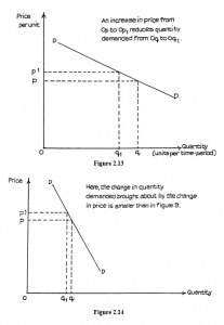
Notice that in Figure 2.13 a given change in price appears to produce a greater change in quantity demanded than in Figure 2.14. This is assuming that they are drawn to the same scale. You must remember that the steepness of a demand curve will be affected by the scale of the (horizontal) X-axis, and graphs must be drawn to the same scale, so that comparisons can be made.
It is a convention (general rule) in economics that price per unit is measured on the vertical (often called the Y) axis, while quantity in units per period of time is measured along the horizontal X-axis. It is often customary to label the axes simply “Price” and “Quantity”.
CONSUMER SURPLUS
The Consumer Surplus is the difference between what a consumer would have been willing to pay for units of a good and what the consumer actually does pay.
These ideas are illustrated in Figure 2.15, which shows a normal demand curve for a product the price of which is 0P. The fact that the demand curve extends to prices higher than 0P indicates that there are consumers who are willing to pay a higher price. However, if the price charged is 0P, then these consumers achieve a surplus which is represented by the shaded area.
What the consumer is willing to pay is shown by the demand curve. What he actually does pay is shown by the market price.