
INTRODUCTION
Businesses and governments use statistical analysis of information collected at regular intervals over extensive periods of time to plan future policies. For example, sales values or unemployment levels recorded at yearly, quarterly or monthly intervals are examined in an attempt to predict their future behaviour. Such sets of values observed at regular intervals over a period of time are called time series.
The analysis of this data is a complex problem as many variable factors may influence the changes. The first step is to plot the observations on a scattergram, which differs from those we have considered previously, as the points are evenly spaced on the time axis in the order in which they are observed, and the time variable is always the independent variable. This scattergram gives us a good visual guide to the actual changes but is very little help in showing the component factors causing these changes or in predicting future movements of the dependent variable.
Statisticians have constructed a number of mathematical models to describe the behaviour of time series, and several of these will be discussed in this study unit and the next.
STRUCTURE OF A TIME SERIES
These models assume that the changes are caused by the variation of four main factors dealt with below they differ in the relationship between these factors. It will be easier to understand the theory in detail if we relate it to a simple time series so that we can see the calculations necessary at each stage.
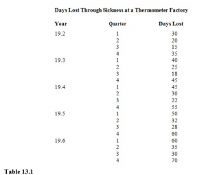
Consider a factory employing a number of people in producing a particular commodity, say thermometers. Naturally, at such a factory during the course of a year some employees will be absent for various reasons. The following table shows the number of days lost through sickness over the last five years. Each year has been broken down into four quarters of three months. We have assumed that the number of employees at the factory remained constant over the five years.
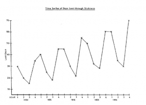
We will begin by plotting the scattergram for the data, as shown in Figure 13.2.
The scattergram of a time series is often called a historigram. (Do not confuse this with a histogram, which is a type of bar chart.) Note the following characteristics of a historigram:
- It is usual to join the points by straight lines. The only function of these lines is to help your eyes to see the pattern formed by the points.
- Intermediate values of the variables cannot be read from the historigram.
- A historigram is simpler than other scattergrams since no time value can have more than one corresponding value of the dependent variable.
- Every historigram will look similar to this, but a careful study of the change of pattern over time will suggest which model should be used for analysis.
Trend
This is the change in general level over the whole time period and is often referred to as the secular trend. You can see in Figure 9.1 that the trend is definitely upwards, in spite of the obvious fluctuations from one quarter to the next.
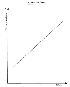
A trend can thus be defined as a clear tendency for the time series data to travel in a particular direction in spite of other large and small fluctuations. An example of a linear trend is shown in Figure 13.3. There are numerous instances of a trend, for example the amount of money collected from Rwandan taxpayers is always increasing; therefore any time series describing income from tax would show an upward trend. Figure 13.3
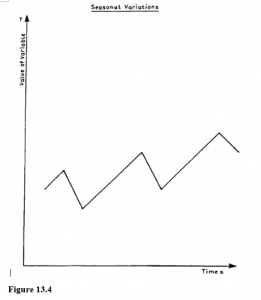
Seasonal Variations
These are variations which are repeated over relatively short periods of time. Those most frequently observed are associated with the seasons of the year, e.g. ice-cream sales tend to rise during the summer months and fall during the winter months. You can see in our example of employees’ sickness that more people are sick during the winter than in the summer.
If you can establish the variation throughout the year then this seasonal variation is likely to be similar from one year to the next, so that it would be possible to allow for it when estimating values of the variable in other parts of the time series. The usefulness of being able to calculate seasonal variation is obvious as, for example, it allows ice-cream manufacturers to alter their production schedules to meet these seasonal changes. Figure 13.4 shows a typical seasonal variation that could apply to the examples above.
Cyclical Fluctuations
These are long-term but fairly regular variations. They are difficult to observe unless you have access to data over an extensive period of time during which external conditions have remained relatively constant. For example, it is well known in the textile trade that there is a cycle of about three years, during which time demand varies from high to low. This is similar to the phenomena known as the trade cycle which many economists say exists in the trading pattern of most countries but for which there is no generally accepted explanation.
Figure 13.5 shows how such a cyclical fluctuation would relate to an upward trend. In our example on sickness, a cyclical fluctuation could be caused by, say, a two-year cycle for people suffering from influenza.
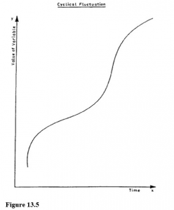
As this type is difficult to determine, it is often considered with the final (fourth) element, and the two together are called the residual variation.
Irregular or Random Fluctuations
Careful examination of Figure 9.1 shows that there are other relatively small irregularities which we have not accounted for and which do not seem to have any easily seen pattern. We call these irregular or random fluctuations and they may be due to errors of observation or to some one-off external influence which is difficult to isolate or predict. In our example there may have been a measles epidemic in 19.5, but it would be extremely difficult to predict when and if such an epidemic would occur again.
Summary
To sum up, a time series (Y) can be considered as a combination of the following four factors:
Trend (T)
Seasonal variation (S)
Cyclical fluctuation (C)
Irregular fluctuations (I)
It is possible for the relationship between these factors and the time series to be expressed in a number of ways through the use of different mathematical models. We are now going to look in detail at the additive model and in the next study unit we will cover briefly the multiplicative and logarithmic models. The additive model can be expressed by the equation:
Time Series = Trend + Seasonal Variation + Cyclical
Fluctuations + Random Fluctuations
i.e. Y=T+S+C+I
Usually the cyclical and random fluctuations are put together and called the ‘residual’ (R),
i.e. Y=T+S+R
CALCULATION OF COMPONENT FACTORS FOR THE ADDITIVE MODEL
Trend
The most important factor of a time series is the trend, and before deciding on the method to be used in finding it, we must decide whether the conditions that have influenced the series have remained stable over time. For example, if you have to consider the production of some commodity and want to establish the trend, you should first decide if there has been any significant change in conditions affecting the level of production, such as a sudden and considerable growth in the national economy. If there has, you must consider breaking the time series into sections over which the conditions have remained stable.
Having decided the time period you will analyse, you can use any one of the following methods to find the trend. The basic idea behind most of these methods is to average out the three other factors of variation so that you are left with the long-term trend.
Graphical Method
Once you have plotted the historigram of the time series, it is possible to draw in by eye a line through the points to represent the trend. The result is likely to vary considerably from person to person, unless the plotted points lie very near to a straight line, so it is not a satisfactory method.
Semi-Averages Method
This is a simple method which involves very little arithmetic. The time period is divided into equal parts, and the arithmetic means of the values of the dependent variable in each half are calculated. These means are then plotted at the quarter and three-quarters position of the time series. The line adjoining these two points represents the trend of the series. Note that this line will pass through the overall mean of the values of the dependent variable. In our example which consists of five years of data, the midpoint of the whole series is mid-way between quarter 2 and quarter 3 of 19.4.