
GENERAL
When studying frequency distributions, we were always handling only one variable, e.g. height or weight. Having learned how to solve problems involving only one variable, we should now discover how to solve problems involving two variables at the same time.
If we are comparing the weekly takings of two or more firms, we are dealing with only one variable, that of takings; if we are comparing the weekly profits of two or more firms, we are dealing with only one variable, that of profits. But if we are trying to assess, for one firm (or a group of firms), whether there is any relationship between takings and profits, then we are dealing with two variables, i.e. takings and profits.
SCATTER DIAGRAMS
A scatter diagram or scattergram is the name given to the method of representing these figures graphically. On the diagram, the horizontal scale represents one of the variables (let’s say height) while the other (vertical) scale represents the other variable (weight).
Degrees of Correlation
In order to generalise our discussion, and to avoid having to refer to particular examples such as height and weight or impurity and cost, we will refer to our two variables as x and y. On scatter diagrams, the horizontal scale is always the x scale and the vertical scale is always the y scale. There are three degrees of correlation which may be observed on a scatter diagram.
The two variables may be:
- Perfectly Correlated
- Uncorrelated
- Partly Correlated
Different Types of Correlation
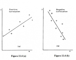
There is a further distinction between correlations of the height/weight type and those of the impurity/cost type. In the first case, high values of the x variable are associated with high values of the y variable, while low values of x are associated with low values of y. On the scatter diagram (Figure 11.6 (a)), the points have the appearance of clustering about a line which slopes up to the right. Such correlation is called POSITIVE or DIRECT correlation.
In the other case (like the impurity/cost relationship) high values of the x variable are associated with low values of the y variable and vice versa; on the scatter diagram (Figure 11.6 (b)) the approximate line slopes down to the right. This correlation is said to be NEGATIVE or INVERSE.
Linear Correlation
The correlation is said to be linear when the relationship between the two variables is linear. In other words all the points can be represented by straight lines. For example, the correlation between car ownership and family income may be linear as car ownership is related in a linear fashion to family income.
Non-linear Correlation
Non-linear correlation is outside the scope of this course but it is possible that you could be required to define it in an examination question. It occurs when the relationship between the two variables is non-linear. An example is the correlation between the yield of a crop, like carrots, and rainfall. As rainfall increases so does the yield of the crop of carrots, but if rainfall is too large the crop will rot and yield will fall. Therefore, the relationship between carrot production and rainfall is non-linear.
THE CORRELATION COEFFICIENT
General
If the points on a scatter diagram all lie very close to a straight line, then the correlation between the two variables is stronger than it is if the points lie fairly widely scattered away from the line.
To measure the strength, or intensity, of the correlation in a particular case, we calculate a LINEAR CORRELATION COEFFICIENT, which we indicate by the small letter r. In textbooks and examination papers you will sometimes find this referred to as Pearson’s Product Moment Coefficient of Linear Correlation, after the English statistician who invented it. It is also known as the product-moment correlation coefficient.
Characteristics of a Correlation Coefficient
We know what the + and – signs of the correlation coefficient tell us: that the relationship is positive (increase of x goes with increase of y) or negative (increase of x goes with decrease of y). But what does the actual numerical value mean? Note the following points:
- The correlation coefficient is always between -1 and +1 inclusive. If you get a numerical value bigger than 1, then you’ve made a mistake!
- A correlation coefficient of -1.0 occurs when there is PERFECT NEGATIVE CORRELATION, i.e. all the points lie EXACTLY on a straight line sloping down from left to right.
- A correlation of O occurs when there is NO CORRELATION.
- A correlation of +1.0 occurs when there is PERFECT POSITIVE CORRELATION,
i.e. all the points lie EXACTLY on a straight line sloping upwards from left to right.
A correlation of between O and ± 1.0. indicates that the variables are PARTLY CORRELATED. This means that there is a relationship between the variables but that the results have also been affected by other factors.
In our example (r = -0.88), we see that the two variables are quite strongly negatively correlated. If the values of r had been, say, -0.224, we should have said that the variables were only slightly negatively correlated. For the time being, this kind of interpretation is all that you need consider.
Significance of the Correlation Coefficient
Correlation analysis has been applied to data from many business fields and has often proved to be extremely useful. For example, it has helped to locate the rich oil fields in the North Sea and also helps the stockbroker to select the best shares in which to put his clients’ money.
Like many other areas of statistical analysis, correlation analysis is usually applied to sample data. Thus the coefficient, like other statistics derived from samples, must be examined to see how far they can be used to make generalised statements about the population from which the samples were drawn. Significance tests for the correlation coefficient are possible to make, but they are beyond the scope of this course, although you should be aware that they exist.
We must be wary of accepting a high correlation coefficient without studying what it means. Just because the correlation coefficient says there is some form of association, we should not accept it without some other supporting evidence. We must also be wary of drawing conclusions from data that does not contain many pairs of observations. Since the sample size is used to calculate the coefficient, it will influence the result and, whilst there are no hard and fast rules to apply, it may well be that a correlation of 0.8 from 30 pairs of observations is a more reliable statistic than 0.9 from 6 pairs.
Another useful statistic is r2 (r squared); this is called the coefficient of discrimination and may be regarded as the percentage of the variable in y directly attributable to the variation in x. Therefore, if you have a correlation coefficient of 0.8, you can say that approximately 64 per cent (0.82) of the variation in y is explained by variations in x. This figure is known as the explained variation whilst the balance of 36% is termed the unexplained variation. Unless this unexplained variation is small there may be other causes than the variable x which explain the variation in y, e.g. y may be influenced by other variables or the relationship may be non-linear.
In conclusion, then, the coefficient of linear correlation tells you only part of the nature of the relationship between the variables; it shows that such a relationship exists. You have to interpret the coefficient and use it to deduce the form and find the significance of the association between the variables x and y.
Note on the Computation of r
Often the values of x and y are quite large and the arithmetic involved in calculating r becomes tedious. To simplify the arithmetic and hence reduce the likelihood of numerical slips, it is worth noting the following points:
- We can take any constant amount off every value of x
- We can take any constant amount off every value of y
- We can divide or multiply every value of x by a constant amount
- We can divide or multiply every value of y by a constant amount
all without altering the value of r. This also means that the value of r is independent of the units in which x and y are measured.
Let’s consider the above example as an illustration. We shall take 5 off all the x values and 2 off all the y values to demonstrate that the value of r is unaffected. We call the new x and y values, x’ (xdash) and y’ respectively:
RANK CORRELATION
General
Sometimes, instead of having actual measurements, we only have a record of the order in which items are placed. Examples of such a situation are:
- We may arrange a group of people in order of their heights, without actually measuring them. We could call the tallest No.l, the next tallest No. 2, and so on.
- The results of an examination may show only the order of passing, without the actual marks; the highest-marked candidate being No. 1, the next highest being No. 2, and so on.
Data which is thus arranged in order of merit or magnitude is said to be RANKED.
Tied Ranks
Sometimes it is not possible to distinguish between the ranks of two or more items. For example, two students may get the same mark in an examination and so they have the same rank. Or, two or more people in a group may be the same height. In such a case, we give all the equal ones an average rank and then carry on as if we had given them different ranks.