
BREAK-EVEN ANALYSIS
For any business there is a certain level of sales at which there is neither a profit nor a loss, i.e. the total income and the total costs are equal. This point is known as the break-even point. It is very easy to calculate, and it can also be found by drawing a graph called a breakeven chart.
Calculation of Break-Even Point – Example
As shown in the last unit, you must be able to layout a marginal cost statement before doing Break Even formulas.
Formulae
The general formula for finding the break-even point in volume is:
| Fixed costs
Contribution per unit |
(this is, of course, exactly what we did in the example).
If the break-even point is required in terms of sales value, rather than sales volume, the formula that should be used is as follows:
Break-even point = Fixed costs
C/ s ratio
| The C/s ratio is Contribution × 100.
Sales |
For example, the contribution earned by selling one unit of Product A at a selling price of RWF10 is RWF4.
C/s ratio = RWF4 × 100 = 40%
RWF10
In our example of the dinner-dance, the break-even point in revenue would be:
rwf180
3 = RWF504
rwf 8.40
The committee would know that all costs (both variable and fixed) would be exactly covered by revenue when sales revenue earned equals RWF504. At this point no profit nor loss would be received.
Suppose the committee were organising the dinner in order to raise money for charity, and they had decided in advance that the function would be cancelled unless at least RWF120 profit would be made. They would obviously want to know how many tickets they would have to sell to achieve this target.
Now, the RWF3 contribution from each ticket has to cover not only the fixed costs of RWF180, but also the desired profit of RWF120, making a total of RWF300. Clearly they will have to sell 100 tickets (RWF300 divided by RWF3).
To state this in general terms:
Volume of sales needed to achieve a given profit =
Fixed costs + Desired profit
Contribution per unit
Suppose the committee actually sold 110 tickets. Then they have sold 50 more than the number needed to break even. We say they have a margin of safety of 50 units, or of RWF420 (50 × RWF8.40), i.e.
Margin of safety = Sales achieved – Sales needed to break even.
The margin of safety is defined as the excess of normal or actual sales over sales at breakeven point.
It may be expressed in terms of sales volume or sales revenue.
Margin of safety is very often expressed in percentage terms:
| Sales achieved − Sales needed to break even × 100% Sales achieved |
i.e. the dinner committee have a percentage margin of safety of 50/110 × 100% = 45%.
The significance of margin of safety is that it indicates the amount by which sales could fall before a firm would cease to make a profit. Thus, if a firm expects to sell 2,000 units, and calculates that this would give it a margin of safety of 10%, then it will still make a profit if its sales are at least 1,800 units (2,000 – 10% of 2,000), but if its forecasts are more than 10% out, then it will make a loss.
The profit for a given level of output is given by the formula: (Output × Contribution per unit) – Fixed costs.
It should not, however, be necessary for you to memorise this formula, since when you have understood the basic principles of marginal costing, you should be able to work out the profit from first principles.
Consider again our example of the dinner. What would be the profit if they sold (a) 200 tickets (b) RWF840 worth of tickets?
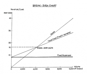
Plotting the Graph
The graph is drawn with level of output (or sales value) represented along the horizontal axis and costs/revenues up the vertical axis. The following are the stages in the construction of the graph:
- Plot the sales line from the above figures.
- Plot the fixed expenses line. This line will be parallel to the horizontal axis.
- Plot the total expenses line. This is done by adding the fixed expenses of RWF8,000 to each of the variable costs above.
- The break-even point (often abbreviated to BEP) is represented by the meeting of the sales revenue line and the total cost line. If a vertical line is drawn from this point to meet the horizontal axis, the break-even point in terms of units of output will be found. The graph is illustrated in Figure 1.
Note that, although we have information available for four levels of output besides zero, one level is sufficient to draw the chart, provided we can assume that sales and costs will lie on straight lines. We can plot the single revenue point and join it to the origin (the point where there is no output and therefore no revenue). We can plot the single cost point and join it to the point where output is zero and total cost = fixed cost.
Break-even Chart for More Than One Product
Because we were looking at one product only in the above example, we were able to plot “volume of output” and straight lines were obtained for both sales revenue and costs. If we wish to take into account more than one product, it is necessary to plot “level of activity” instead of volume of output. This would be expressed as a percentage of the normal level of activity, and would take into account the mix of products at different levels of activity.
Even so, the break-even chart is not a very satisfactory form of presentation when we are concerned with more than one product: a better graph, the profit-volume graph, is discussed in the next study unit. The problem with the break-even chart is that we should find that, because of the different mixes of products at the different activity levels, the points plotted for sales revenue and variable costs would not lie on a straight line.
Assumptions and Limitations of Break-Even Charts
Apart from the above point about the difficulty of dealing with more than one product, you should bear the following points in mind:
- Break-even charts are only accurate within fairly narrow levels of output. This is because if there were to be a substantial change in the level of output, the proportion of fixed costs could change.
- Even with only one product, the income line may not be straight. A straight line implies that the manufacturer can sell any volume he likes at the same price. This may well be untrue: if he wishes to sell more units he might have to reduce the price. Whether this increases or decreases his total income depends on the elasticity of demand for the product. Therefore the sales line may curve upwards or downwards, but in practice is unlikely to be straight.
- Similarly, we have assumed that variable costs have a straight line relationship with level of output, i.e. variable costs vary directly with output. This might not be true. For instance, the effect of diminishing returns might cause variable costs to increase beyond a certain level of output.
- Break-even charts only hold good for a limited time-span. Nevertheless, within these limitations a break-even chart can be a very useful tool. Managers who are not wellversed in accountancy find it easier to understand a break-even chart than a calculation showing the break-even point.
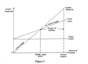
General Points on the Interpretation of Break-Even Charts
The skeleton break-even chart (Figure 2) illustrates the following points:
Margin of Safety
The margin of safety – i.e. the extent by which sales could fall before a loss was incurred – is easily read from the graph.
Angle of Incidence
The angle a marked on the chart is referred to as the angle of incidence. This shows the rate at which profits increase once the break-even point is passed. A large angle of incidence means a high rate of earning (equally it means that if sales fell below breakeven point, the loss would increase rapidly). This is also illustrated by the size of the profit and loss wedges.
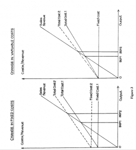
Changes in Cost Structure
If costs increase, the break-even point will be reached at a higher level of sales. The breakeven chart (Figure 3) illustrates the effect of changes.
THE PROFIT VOLUME GRAPH
The profit volume graph provides an alternative presentation to the break-even chart discussed in the previous study unit. It may be more easily understood by managers who are not used to accountancy or statistics.
In this graph, sales revenue is plotted on the horizontal axis, against profit/loss on the vertical axis. It is therefore necessary to work out the profit before starting to plot the graph. This is done using the marginal costing equation.
Sales revenue – Variable cost = Fixed cost + Profit
or Profit = Sales revenue – Variable cost × Fixed cost or Profit = Contribution per unit × No. of units – Fixed cost
The general form of the graph is illustrated in Figure 6.
USE OF THE PROFIT VOLUME GRAPH FOR MORE THAN ONE PRODUCT
In order to draw a profit volume graph for several products it is necessary to calculate:
- Sales revenue for each product and cumulative sales revenue.
- Contribution for each product, cumulative contribution and hence profit.
The graph is easiest to draw and interpret if the products are taken in order, starting with the most profitable and working back to the least profitable, “profitability” in this context being measured by the relationship which contribution bears to sales revenue.
THE PROFIT/VOLUME OR CONTRIBUTION/SALES RATIO
Calculation
In the calculations for the profit graph in the previous example, we made use of the ratio “contribution: sales” (expressed as a percentage). This ratio has historically been referred to as the “profit: volume ratio”. This is not a very sensible name, because it does not describe what the ratio actually is. In fact, examiners now call it by the more descriptive name of “contribution : sales ratio” (C/S ratio) but you should watch out for the alternative terminology P/V ratio in older textbooks.
The ratio may be calculated as either:
| Selling price per unit − Variable cost per unit
Selling price per unit or Total sales revenue − Total variable cost Total sales revenue |
Alternatively, it may be calculated when variable costs are not known, provided the sales revenue and profit figures are known for two different levels of output.
MARGINAL PROFIT AND LOSS ACCOUNT
Advantages
In the orthodox trading and profit and loss account, the opening and closing stocks are debited and credited respectively, and the valuations placed upon them include a share of production fixed overheads. Accountants who believe in using marginal costing take the view that all fixed costs should be written off in the period in which they are incurred and that there can be no justification for carrying part of one period’s costs forward to the next period in closing stock. They argue that fixed costs are incurred on a time basis, regardless of the level of production or sales in any period. They claim, therefore, that a closing stock valuation which excludes any element of cost is more “accurate”. The exclusion of fixed costs does ensure that the writing off of fixed costs is not deferred until a later period. The main advantage of the marginal form of profit and loss account is, therefore, that the profit will not be affected simply because of a significant change in the stock figures: profit is clearly related to the level of sales.