
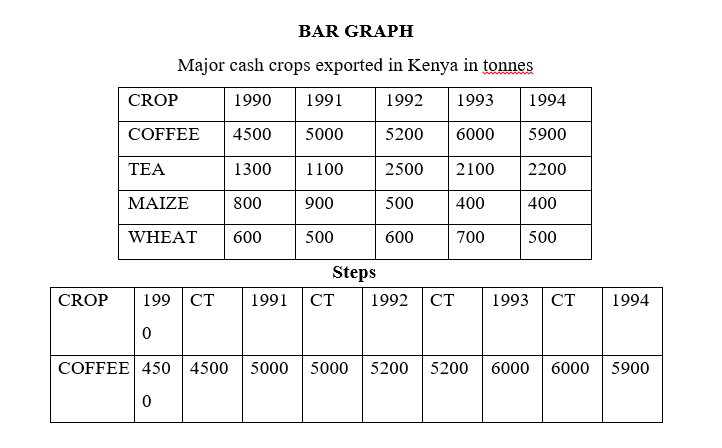
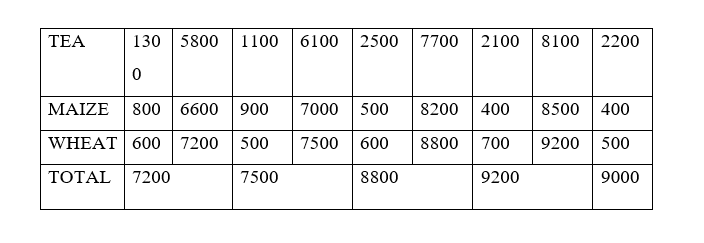
- Set cumulative totals for the data each year
- Draw vertical axis(Y) to represent dependent variable
- Draw horizontal axis(x) to represent independent variable
- Label both axis using suitable scale
- Plot the cumulative values for each year
- Use values for components to subdivide the cumulative bar
- The subdivisions are placed in descending order with the longest at the bottom(coffee)
- Shade each component differently
- Put title and key
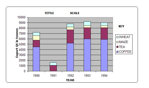
Advantages
- Its easy to construct
- It has good visual impression
- There is easy comparison for the same component in different bars because of uniform shading
- Easy to interpret because bars are shaded differently
- Total value of the bar can be identified easily
Disadvantages
- It doesn‟t show the trend of components (change over time).
- Cant be used to show many components as there is limited space upwards
- Tedious as there is a lot of calculation work involved.
- Not easy to trace individual contribution made by members of the same bar
- Poor choice of vertical scale causes exaggeration of bars length leading to wrong conclusions
Analysis
- Coffee was the leading export earner in the five years.
- Tea was the second leading export earner.
- Wheat had the lowest export quantity.
- 1993 recorded the highest export quantity.
- 1990 recorded the lowest export quantity.
nb-leave ahaif apage for example 2
PIECHART/DIVIDEDCIRCLES/CIRCLE CHARTS
- A circle which has been subdivided into degrees used to represent statistical data where component values have been converted in degrees.
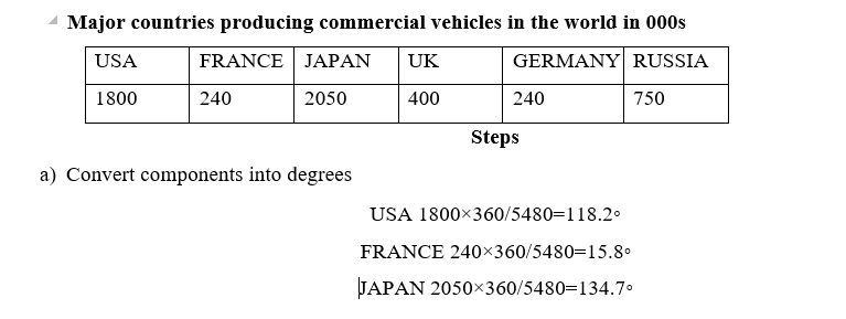
2. Draw a circle of convenient size using a pair of compasses.
3. From the centre of the circle mark out each calculated angle using a protractor.
4. Shade the sectors differently and provide the key for various shadings.
Advantages
- Gives a good/clear visual impression
- Easy to draw.
- Can be used to present varying types of data e.g. minerals, population, etc.
- Easy to read and interpret as segments are arranged in descending order and are also well shaded.
- Easy to compare individual segments.
Disadvantages
- Difficult to interpret if segments are many.
- Tedious due to a lot of mathematical calculations and marking out of angles involved.
- Can‟t be used to show trend/change over a certain period.
- Small quantities or decimals may not be easily represented.
Analysis
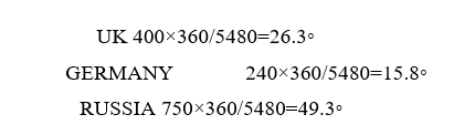
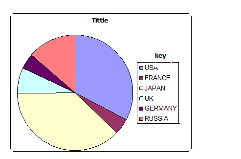
- The main producer of commercial vehicles is Japan.
- The second largest producer is USA followed by Russia.
- The lowest producers were France and West Germany with.
PROPORTIONAL CIRCLES
This is use of circles of various sizes to represent different sets of statistical data.
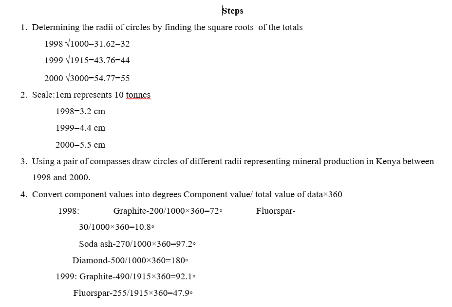
On the proportional circle for each year use a protractor and mark out the angles 6. Shade the segments and then provide a key.
Advantages
- They give a good visual impression.
- Easy to compare various components.
- Simple to construct.
- Easy to interpret as segments are arranged in descending order.
- Can be used to present varying types of data.
Disadvantages
- Tedious in calculation and measurement of angles
- Actual values represented by each component cant be known at a glance
- Difficult to accurately measure and draw sectors whose values are too small.
- Comparison can be difficult if the circles represent values which are almost equal.
Analysis/Conclusions
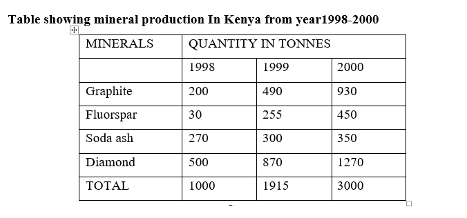
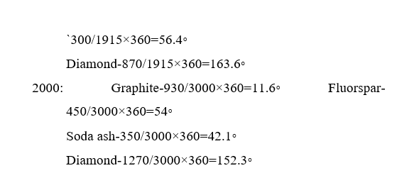
- Diamond was leading in production.
- The second leading mineral in production was graphite.
- The mineral with the lowest production was fluorspar.
nb-leave ahaif apage for example 2
Share this: