
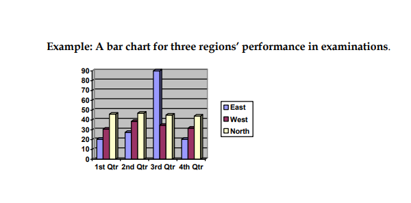
BAR CHARTS
These are some of the most popular ways of presenting statistics A bar chart consists of strips of different lengths each representing a numerical figure. The longer the bar the larger the figure it denotes
How to construct a bar chart
1. Decide on the scale in which the figures are to be represented example 1 cm for $500.
2. Draw the axis – the lines which the scale is marked mark out the scale at regular intervals.
3. Decide on the order of the bars. If they show statistics over a period of time they should be arranged in chronological order.
4. Label the bars if necessary making sure that all writing is horizontal so that it can be read easily.
5. Give the chart a clear heading if possible at the top.
6. Give the source of the data used to reassure the reader that the figures are accurate.
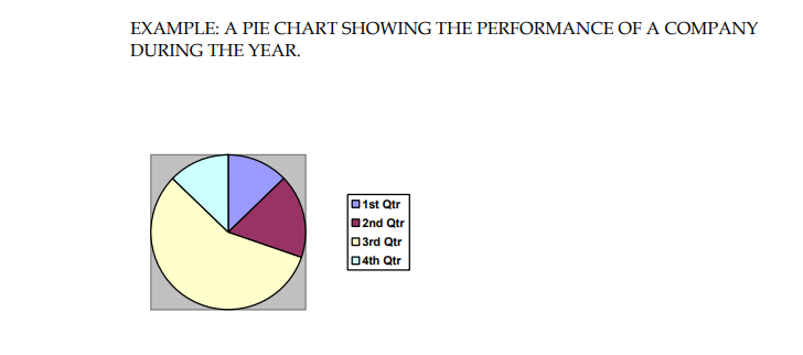
PIE CHARTS
They are used to show the relative size of separate components of a whole. For example they can be used to show how the income of a country is spent.
GRAPHS
Graphs are a valuable form of visual communication they are a means of presenting data on the relationship between two constantly changing elements in the form of single line , the shape of which reveals the nature of the relationship at a glance.
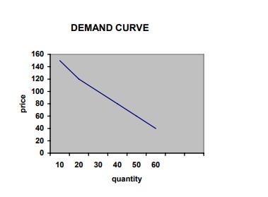
HOW TO DRAW A GRAPH
1. Use a graph paper
2. choose the variables for each axis
3. Choose the scales for the two axis which will fit the graph paper
4. Mark off the axis at regular intervals
5. Plot the points of the graph.
6. join the points to draw the line graph
7. make sure each axis is labeled to show what information it gives and the scale used
8. Give the graph a clear title